PHPTaqwim: Lint and format PHP using Typescript!

It is true. I created a VSCode plugin using Typescript to lint and format PHP files.

Current status of PHP Linter tools

While PHP has been around for a long time, linting and formatting PHP files are not as supported or maitained as other languages (say Javascript or python).

PHP has built in linting switch php -l, but its only for syntax errors. It does not check for code style or formatting. This functionality can be easily added using many of the VSCode extensions.

In addition to that, there two popular libraries to lint/format PHP files:

1- PHP Code Sniffer

  • Has the most installs on packagist.
  • Not regularly maintained. Commits are few and far between.
  • Has an outdated documentation (last updated in 2016).
  • Uses xml for configuration which is an outdated format for configuration.

2- PHP CS Fixer

  • Highly maintined and regularly updated.
  • It has fewer installs than PHP Code Sniffer, but the margin is not that big.
  • Has a detailed documentation but it is still hard to navigate.
  • Uses PHP for configuration which is a better format than xml but still not ideal.

Unfortunately, both libraries are not easy to configure and setup. Also, both libraries have a number of VSCode extensions, but they require the path to PHP executable to be set in the configuration, which is not as easy as it sounds, at least in my experience.

This extension

PHPTaqwim (Arabic for correction) aims to be a simple and easy to use extension to lint and format PHP files. It requires no configuration and it works out of the box. It is also configurable if you want to customize it.

PHPTaqwim warnings

Interestingly, it is written in Typescript, not PHP. This is the reason that it does not require PHP runtime to be installed on your machine. It uses PHP Parser under the hood to get PHP AST and apply the rules.

It also comes as a NPM CLI package, so you can use it in your CI/CD pipeline.

Vue Options to Composition API Online Converter

If you are reading this, chances are you have old projects using Vue2 options API and you want to migrate it to Vue3.

One of the main features that were introduced in vue3 is composition API. It helps writing a code that resembles “regular” JavaScript functions.

While Vue team has provided backward compatibility for options API, it is still a good idea to migrate the code to get the benefit of the new features in Vue3 and have a more maintainable code.

However, many developers choose not to migrate for a multitude of reasons.

  • Migration might introduce new bugs to a rather working code (if the code is not broke don’t fix it).
  • There is a learning curve required when rewrite the code with the new features.
  • Busy schedule. Most developers work on few projects simultaneously and do not have enough time for improving old code.

This is why I developed this online tool. It converts options API to composition API without much effort from the developers.

The tool can convert this code:

// https://github.com/gitlabhq/gitlabhq/blob/e6d048d769240760008f0dbb6b811e1ebc675292/app/assets/javascripts/ide/components/repo_tab.vue#L3

import { GlIcon, GlTab } from '@gitlab/ui';
import { mapActions, mapGetters } from 'vuex';
import { __, sprintf } from '~/locale';

import ChangedFileIcon from '~/vue_shared/components/changed_file_icon.vue';
import FileIcon from '~/vue_shared/components/file_icon.vue';
import FileStatusIcon from './repo_file_status_icon.vue';

export default {
  components: {
    FileStatusIcon,
    FileIcon,
    GlIcon,
    ChangedFileIcon,
    GlTab,
  },
  props: {
    tab: {
      type: Object,
      required: true,
    },
  },
  data() {
    return {
      tabMouseOver: false,
    };
  },
  computed: {
    ...mapGetters(['getUrlForPath']),
    closeLabel() {
      if (this.fileHasChanged) {
        return sprintf(__('%{tabname} changed'), { tabname: this.tab.name });
      }
      return sprintf(__('Close %{tabname}'), { tabname: this.tab.name });
    },
    showChangedIcon() {
      if (this.tab.pending) return true;

      return this.fileHasChanged ? !this.tabMouseOver : false;
    },
    fileHasChanged() {
      return this.tab.changed || this.tab.tempFile || this.tab.staged || this.tab.deleted;
    },
  },

  methods: {
    ...mapActions(['closeFile', 'updateDelayViewerUpdated', 'openPendingTab']),
    clickFile(tab) {
      if (tab.active) return;

      this.updateDelayViewerUpdated(true);

      if (tab.pending) {
        this.openPendingTab({ file: tab, keyPrefix: tab.staged ? 'staged' : 'unstaged' });
      } else {
        this.$router.push(this.getUrlForPath(tab.path));
      }
    },
    mouseOverTab() {
      if (this.fileHasChanged) {
        this.tabMouseOver = true;
      }
    },
    mouseOutTab() {
      if (this.fileHasChanged) {
        this.tabMouseOver = false;
      }
    },
  },
};

To this

import { GlIcon, GlTab } from '@gitlab/ui';
import { mapActions, mapGetters } from 'vuex';
import { __, sprintf } from '~/locale';
import ChangedFileIcon from '~/vue_shared/components/changed_file_icon.vue';
import FileIcon from '~/vue_shared/components/file_icon.vue';
import FileStatusIcon from './repo_file_status_icon.vue';
import { ref, computed } from 'vue';


// Data
const tabMouseOver = ref('false');

// Props
const props = defineProps({
    tab: {
        type: Object,
        required: true,
    },
});

// Computed
const closeLabel = computed(() => {
    if (fileHasChanged.value) {
        return sprintf(__('%{tabname} changed'), { tabname: props.tab.name });
    }
    return sprintf(__('Close %{tabname}'), { tabname: props.tab.name });
})

const showChangedIcon = computed(() => {
    if (props.tab.pending) return true;

    return fileHasChanged.value ? !tabMouseOver.value : false;
})

const fileHasChanged = computed(() => {
    return props.tab.changed || props.tab.tempFile || props.tab.staged || props.tab.deleted;
})


// Methods
const clickFile = function(tab) {
    if (tab.active) return;

    this.updateDelayViewerUpdated(true);

    if (tab.pending) {
        this.openPendingTab({ file: tab,
            keyPrefix: tab.staged ? 'staged' : 'unstaged' });
    } else {
        this.$router.push(this.getUrlForPath(tab.path));
    }
}

const mouseOverTab = function() {
    if (this.fileHasChanged) {
        tabMouseOver.value = true;
    }
}

const mouseOutTab = function() {
    if (this.fileHasChanged) {
        tabMouseOver.value = false;
    }
}

You can see the tool here: https://kalimah-apps.com/vue-options-to-composition

When you use this tool please remember that it does not cover all cases. It is useful to get you a step head and remove one hurdle from the code migrating process.

If you would like to contribute, report a bug or request a feature you can check the repo at GitHub:

https://github.com/kalimahapps/vue-options-to-composition

4 VSCode extensions I use when developing with Tailwind

TL;DR

All these extensions are available in this VSCode extension pack TailwindCSS Kit

1. Tailwind CSS IntelliSense

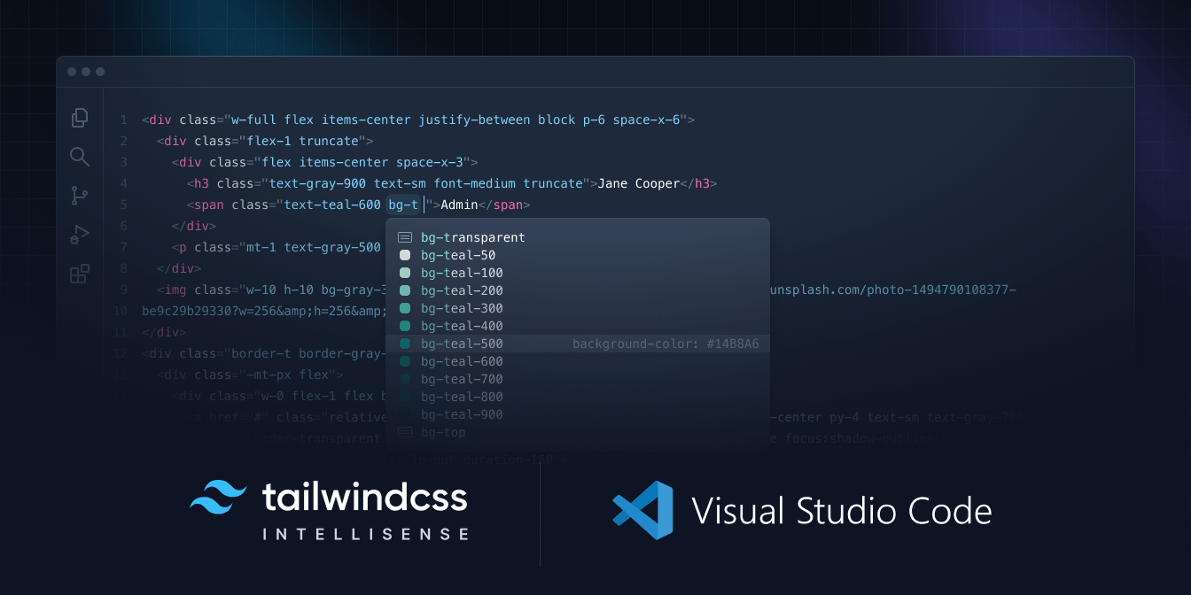
tailwind css intellisnse image

Tailwind CSS IntelliSense is a powerful tool that can help developers to write code faster and more efficiently. The tool provides real-time suggestions for Tailwind CSS classes, reducing errors and improving code quality. By using IntelliSense, developers can increase productivity, reduce the learning curve, and improve the accessibility of their applications. If you are a developer working with Tailwind CSS, be sure to take advantage of this powerful feature.

2. Tailwind Fold

tailwind fold extension image

This extension is extremely helpful when working with Tailwind. Long list of classes can clutter the html part and this extension provide a great way of hiding them away and show them only when needed. In addition to the default functionality, the options are well-thought and fit almost any preference. For example, I like the classes to be unfolded when I click on the line not the class itself, and there is an option for that.

I gave the extension 5 stars rating but there is one issue I would like to see improved. I use eslint with eslint tailwind plugin which breaks long classes into multiple lines. The extension does not seem to fold classes that spans over multiple lines.

3. Tailwind Documentation

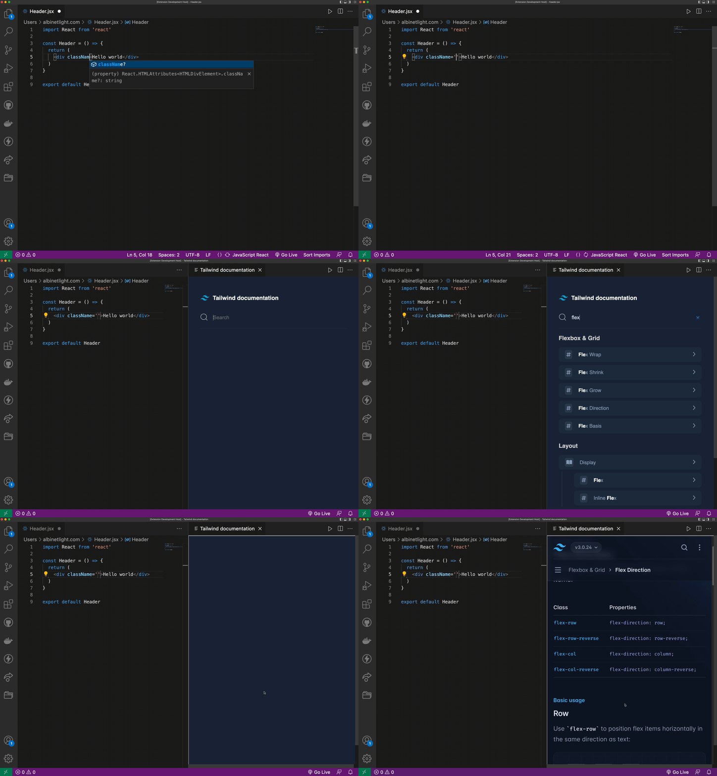
Tailwind Documentation image

The Tailwind Documentation extension provides quick access to the official Tailwind CSS documentation. This extension enables developers to access the Tailwind CSS documentation directly from within the VSCode editor, without having to open a browser or leave the editor.

4. Tailwind Config Viewer

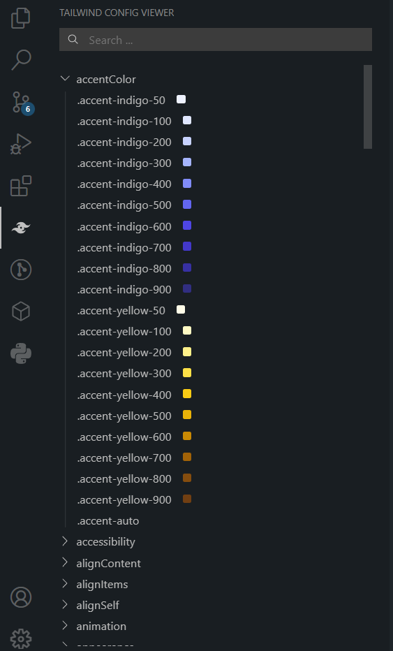
Tailwind Config Viewer image

Tailwind config can be confusing. They might expand exponentially and make it harder for users to know the resolved config. This is why I created this extension. It enables users to view the resolved Tailwind config and it will also show the color for any color-related classes (text-*, bg-*, accent-* … etc)

In future, I am planning to make the classes clickable so when a user clicks on a class it will be inserted in html section.

Adding outline to Gutenberg blocks

When building a complex layout using Gutenberg, the most frustrating issue is to select a block or its parent. It is rare occurrence (at least in my experience) that you can select a block on first click without the help of the breadcrumbs at the bottom of the editor.

To solve this problem we can add an outline to each block to clearly show nested blocks and click on the appropriate one.

First we need to enqueue the style file.
Add this code to functions.php in your theme or main file in your plugin:

add_action('enqueue_block_editor_assets', function () {
    wp_enqueue_style('outline-style', plugin_dir_url(__FILE__) . "/outline-style.css", false, '1.0', 'all');
});

Then add this style inside oytline.style.css (code is presented in SCSS, make sure to convert to CSS before using it):

.wp-block {
    outline: 1px solid transparent;
    outline-offset: 7px;
    transition: all 0.2s;
    &:hover {
        outline-color: lightgray;
    }
    .wp-block {
        outline-offset: 2px;
    }
}

The code will add an outline around each block but there is still an issue of identifying the name of the block especially when using custom blocks.

We can modify the style a little bit to add the title of the block on the right top corner (code in SCSS):

.wp-block {
    outline: 1px solid transparent;
    outline-offset: 7px;
    transition: all 0.2s;
    &:hover {
        outline-color: lightgray;

        &::before {
            content: attr(data-type);
            padding: 0.3em 0.6em;
            font-size: 0.8rem;
            position: absolute;
            color: black;
            font-family: 'Trebuchet MS', 'Lucida Grande', 'Lucida Sans Unicode', 'Lucida Sans', Tahoma, sans-serif;
            top: 0;
            right: 0;
            left: initial !important;
            background-color: lightgray;
            transition: all 0.2s;
            pointer-events: none;
            z-index: 5;
            font-weight: normal;
        }
    }

    .wp-block {
        outline-offset: 2px;
    }
}

While this works fine there might be further issues that uses face. For example, some users want to always display outline (not just on hover), change the color, opacity or not display it at all.

To fix these issues I developed a WordPress plugin that enables users to change outline settings (like color, opacity and style) as well as show/hide the outline.

You can find the plugin here:
https://wordpress.org/plugins/editor-block-outline/

Trace activity in WordPress

One of the areas that WordPress lacks is logging user activity. In particular the activity of site admins and editors. This is a vital feature as it helps trace back any actions that have caused error or for general troubleshooting.

An attempt has been made to fill this gap with a number of plugins. However, these plugins have some shortcomings make them not very useful (as I have experienced) when debugging errors. The plugins either provide full features for premium version, or generally do not display all the useful information when changes are logged.

That is why I created Nashaat Activity Log plugin. This plugin will log information about most of the changes that occur in WordPress admin area.
Here are some examples what the plugin logs:

  • Post changes (content, options, title, excerpt .. etc).
  • Plugins and themes activation, deactivation, installation, removal and theme switch.
  • Website updates (core, plugins and themes)
  • Taxonomy changes
  • Widget changes (order, adding or deleting)
  • Users changes (profile changes, registration, removal)
  • Login attempts. This is a very useful feature as the plugin records failed attempts with IP address. It will help detecting brute force attacks and possibly blocking the offending IP address.

There are also many other areas where the plugin logs users activity.

This is an example of how logs appear.
Nashaat Activity Log display example

And this is an example of filtering:
Nashaat Activity Log filtering example

New features will be soon added. Currently I am working on adding support for WooCommerce changes (settings, products, tags .. etc). And later I am planning to add support for most popular plugins such as Yoast SEO, Gravity Forms, Advanced Custom Fields (ACF), WPForms, bbPress, Contact Form 7 and Easy Digital Downloads.

To download the plugin you can search for Nashaat Activity Log from your WP plugins page and install it. Or you can download it from this link:

👉 https://wordpress.org/plugins/nashaat-activity-log/

If you face any issues please submit a question in the support forum: https://wordpress.org/support/plugin/nashaat-activity-log/.

Increase tailwind classes readability with this eslint plugin

Tailwind is a popular utility-first CSS framework that has gained significant traction in recent years. It is a highly customizable and easy-to-use framework that can help developers streamline their workflow and create visually appealing websites with less code.

One of the biggest advantages of using Tailwind is that it streamlines the development process. The framework provides a set of pre-defined classes that developers can use to style their HTML elements. This eliminates the need to write custom CSS for every single element on the website, saving a significant amount of time and effort.

With such large amounts of pre-defined classes, sometimes it can be difficult to read and understand at first glance how a particular element is styled.

Let’s look at this example (taken from flowbite):

<label class="relative inline-flex items-center cursor-pointer">
  <input type="checkbox" value="" class="sr-only peer">
  <div class="w-11 h-6 bg-gray-200 peer-focus:outline-none peer-focus:ring-4 peer-focus:ring-blue-300 dark:peer-focus:ring-blue-800 rounded-full peer dark:bg-gray-700 peer-checked:after:translate-x-full peer-checked:after:border-white after:content-[''] after:absolute after:top-[2px] after:left-[2px] after:bg-white after:border-gray-300 after:border after:rounded-full after:h-5 after:w-5 after:transition-all dark:border-gray-600 peer-checked:bg-blue-600"></div>
  <span class="ml-3 text-sm font-medium text-gray-900 dark:text-gray-300">Toggle me</span>
</label>

This is a checkbox that has been styled using Tailwind. It is a single line of code that contains a lot of information. It is not immediately clear how the checkbox is styled.

This is why I developed an eslint plugin that helps developers to better understand how Tailwind classes are being used in their code. The plugin is called @kalimahapps/eslint-plugin-tailwind and it is available on npm. Currently, it has two rules.

tailwind-multiline

With this rule, you can enforce that Tailwind classes are written on multiple lines once they exceed a certain number of characters. This makes it easier to read and understand how the element is styled.

Let’s see how the above example would look like with this rule enabled:

<label class="relative inline-flex items-center cursor-pointer">
    <input type="checkbox" value="" class="sr-only peer">

    <div
        class="w-11
            h-6
            bg-gray-200
            peer-focus:outline-none
            peer-focus:ring-4
            peer-focus:ring-blue-300
            dark:peer-focus:ring-blue-800
            rounded-full
            peer
            dark:bg-gray-700
            peer-checked:after:translate-x-full
            peer-checked:after:border-white
            after:content-['']
            after:absolute
            after:top-[2px]
            after:left-[2px]
            after:bg-white
            after:border-gray-300
            after:border
            after:rounded-full
            after:h-5
            after:w-5
            after:transition-all
            dark:border-gray-600
            peer-checked:bg-blue-600"
    />

    <span class="ml-3 text-sm font-medium text-gray-900 dark:text-gray-300">Toggle me</span>
</label>

As you can see, the classes are now written on multiple lines and from first glance you can identify which classes are being used to style the element.

tailwind-sort

This is the other rule that is included in the plugin. It helps developers to sort the Tailwind classes in a consistent manner. While tailwind provides a prettier plugin to sort the classes, I found it unintuitive and not very useful. The classes in the base layer will be sorted first, followed by the classes in the components layer, and finally the classes in the utilities layer.

This rule, however, sorts classes alphabetically but in groups. For example, it makes sense that bg-sky-500 and dark:bg-sky-100 are grouped together. This is because they are both background colors. The same goes for text-sky-500 and dark:text-sky-100.

Let’s see how the above example would look like with this rule enabled:

<label class="cursor-pointer inline-flex items-center relative">
    <input type="checkbox" value="" class="peer sr-only">

    <div
        class="bg-gray-200
            after:bg-white
            dark:bg-gray-700
            h-6
            after:h-5
            peer
            dark:peer-focus:ring-blue-800
            peer-checked:after:border-white
            peer-checked:after:translate-x-full
            peer-checked:bg-blue-600
            peer-focus:outline-none
            peer-focus:ring-4
            peer-focus:ring-blue-300
            rounded-full
            after:rounded-full
            w-11
            after:w-5
            after:absolute
            after:border
            after:border-gray-300
            after:content-['']
            after:left-[2px]
            after:top-[2px]
            after:transition-all
            dark:border-gray-600"
    />

    <span class="font-medium ml-3 text-gray-900 dark:text-gray-300 text-sm">Toggle me</span>
</label>

I think this is a much more readable and understandable way to write Tailwind classes.

Install and Usage

Currently, the package only works for vue projects. To install and use this plugin in your project checkout readme file:

https://github.com/kalimahapps/eslint-plugin-tailwind